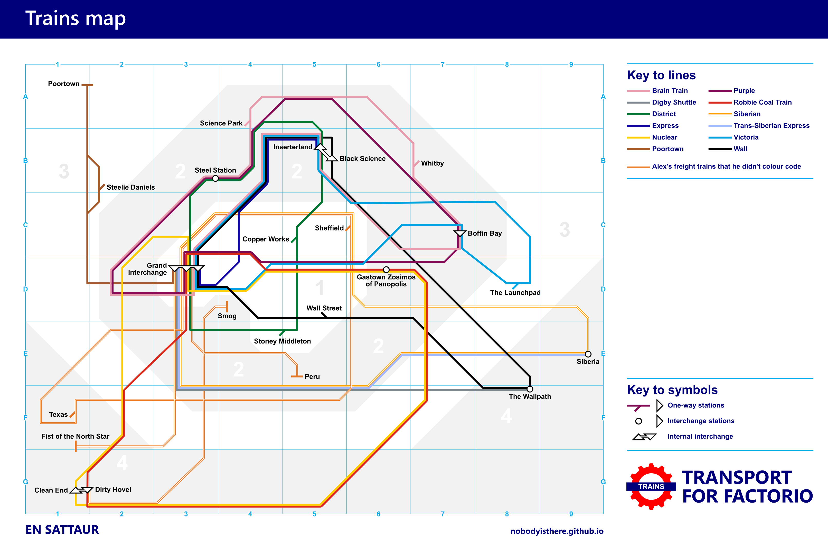
This was pretty fun to make.
It was also pretty interesting! I started this project thinking that it would be easy. After all, most of the hard design work had already been done for me by Transport for London (and Harry Beck). It’s basically just straight lines going through points; Inkscape can handle that easily, right?
This project took many more hours than I ought to have spent on something so silly.
To begin with, there was a major difference between our train layout and the Tube, and that is that Tube lines are bi-directional. You can go to any station and get a train heading in either direction. In Factorio, you don’t usually want to spend the resources to manage double the number of trains (and tracks) you’d have to place for that, so you make the trains go in big, one-way loops.
So the first thing I realised was that my map had to communicate the direction of travel. I settled on changing the station symbols for this, rather than using arrows like the Piccadilly line does around Heathrow. The reason for this is that it’s at stations that the information is most relevant. Generally, when you want to go somewhere, the first thing you’ll do is find your nearest station on the map, and then you can work everything out from there.
The second thing I realised was that making two or more lines bend together around 45-degree corners is an absolute nightmare. You basically need to switch to a 45-degree grid with spacing as wide as your lines, aligned with the position of the bend. I made a little tool for this in Inkscape, a widget that I could drag around and snap all my lines to, but even with this, editing the lines was a pain. It certainly wasn’t the simple “drag points around on a grid” that I had naïvely imagined.
Finally, there are a lot of other little design choices that go into making a map like this. Under what circumstances should you use a 90-degree turn rather than a 45-degree one? At what point do you choose to bend a line? How much do you adjust the real-world distances between stations?
I’ve always thought that the Tube map is lovely (I suspect people in Britain might be conditioned to think that), but I have even more respect for it after this silly little project. I mean, just look at it. It’s great.
Oh, and here’s a link to the timelapse of our session, if you’re interested.